
I love being pulled and immersed in to spontaneous quick clicking little projects. Well - "Well Being" is one of those... Mike and I have worked together to come up with the following brand identity and visuals for our friend Doug Hadel (chiropractic and Chinese medicine practitioner - AMAZING! - by the way, he got Mike thru his knee pain after surgery...). Mike has been asked by Doug to provide some imagery for his new website. And they were talking about several different options and this and that... As I kept listening, I could not help myself and decided to step-in with my two cents to the conversation. I suggested: " Let's step back and look at the bigger picture..."
To keep my story short - the result is that we came up with whole new branding concept, logo, stationery, imagery and website all together. The next logical phase is the actual office space as well (coming soon...) - my brain is already spinning again and seeing the possibilities!
In the meantime, feel free to visit the brand new website to experience the Well Being...
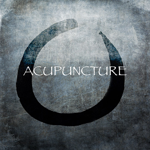
Logo design is based on Doug's little doodle he drew for me when talking about joint and vertebra alignments and dis-alignments. When I saw that - my brain took off...and here we are with the new logo and whole new concept.
The cover image on the website is the result of our collaborative approach with Mike - "it just happens"...and it clicks!
After the logo and this cover image were established we had a pretty good idea about the "look". Since this website is not based on visuals as often is in our world, we decided to keep it pretty abstract but visually coherent. We created individual buttons based on the rings and the toned backgrounds in several different variations.


As for the images through out the website to illustrate the content, we decided to use the "sculpture man" to convey the message, yet keeping it abstract but understandable. And of course - Mike's ever mood setting photography and mojo seals the deal.

Enjoy and check out the website and Doug's services: www.wellbeingkc.com